I'm up to my lip sync and facial expressions now. I think the whole "challenging myself in flash" thing was a bad idea. I'm pretty sure this is the worst animation I've ever done...I wouldn't even call it an animation at the moment. =( I definitely need to learn more about animating and flash and better ways to set up my characters so that it's easier to animate because I think one of my main problems is that I didn't set my characters up so that they're versatile enough for what I want to do because I'd animate and then I'd get to a part where I can't do what I want because of the way my character is set up. I don't know.
And I think I find the whole limited/cut-out animation thing hard. I prefer hand drawn, frame-by-frame because I can do so much more and put so much more expression into it. It's not so static. But maybe I just need to learn more about Flash and animating in Flash to be able to do this kind of thing.
Anyway, must get back to this last bit. I hope putting the facial expressions and lip sync in would make it look better.
Wednesday, June 16, 2010
Wednesday, June 9, 2010
Progress on final project
Ok so my final project is coming along coming along. I have completed all my characters as well as all the backgrounds and I have a pretty final sound mix for my animation (might add some more sounds in it if I think it needs it after I've finished my animation).
I made some changes to my backgrounds that John suggested to keep the continuity of the story. At the beginning there's an establishing shot of the busy, grey city and there willy be a dolly in to Bun walking towards 'Happy Days' the shop where he wants to buy a jar of fresh air. Then to establish the shop and what it is without doing a room pan inside the store, I will have a shot of the shop window which has posters on it advertising the different things the shop sells. Then you hear the door bell as Bun enters the shop, and then this cuts to an establishing shot inside the shop, setting up the two characters and the environment they're in. So to keep the continuity I had to make sure that the shop window was visible in all these shops to keep the flow. I tried my best to fit it into what I had an I think it works pretty well. Not so sure about my perspectives but I've kind of ignored the whole perspective thing as it is flash and one of the flash aesthetics is that perspective is often ignored. =)
Also I had to change the size of my backgrounds from the original by extending it because I'd been using storyboards that were the old size and forgot about the whole 1024x576 thing (can you believe it?!) Haha, it's mainly because I was making the backgrounds bigger than the canvas so I had room for moving and zooming etc.
This is the city establishing shot at the beginning. The two buildings in the foreground will part as I dolly in. There are a few different layers so I can dolly in nicely with the different layers moving at different speeds.
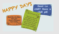

This is the shop window shot. I might just zoom in a slightly on this one. I'm not sure if it's too plain, but I think it gets the idea across and the style of my animation is simple. It sets up the shop and also uses colours from inside the shop which links the two together and also shows the contrast to the city.
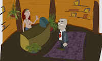 This is the original background for the establishing shot between the two characters inside the shop. The characters are in there just to give a sense of space and location. I had to move around the pot plant because it made too much of a wall between the two characters and if the character moved in front of it it could look odd. I also had to extend the framing because it was too square (old school ratio) and I had to work in the shop window for continuity. John suggested putting it right behind the characters in the background but I decided that it would take too much away from the coziness of the shop and it didn't really suit the original shop plan I had in mind. So I decided to put the window behind Bun instead so that you just see part of it. Now the background also has a nicer flow and sense of movement.
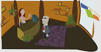 This is what I have ended up with after all the changes.
Putting the characters in the background also gave a good indication of whether the characters work with the background. I changed the colours from the original display frame I had, and with this new frame I had to change the colours of Bun a bit so that parts of him didn't get lost in the background.
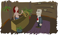 This was the colouring for my original display frame. It was a bit too drabby and dark for my liking. I wanted the shop to be warm and inviting and hippy, so you can see how it has changed from the original to what I have now.
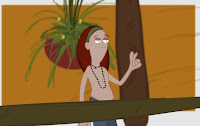
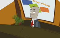 These images are the basic backgrounds I have developed for the closer shots of the two characters. I used the background from the establishing shot and just tweaked it to fit for these shots. I made them a bit bigger so it gives room for various shots...close and mid, and I can easily adjust it as needed as I animate without worrying about redrawing stuff and spending too much time fixing it. I've made the background slightly blurry too, to give a sense of depth and to give focus to the character.
These are my final character designs. I've just changed Bun's colours a bit since these model sheets (his jacket and shirt) and I need to make his hands less banana like. =)
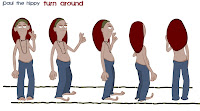
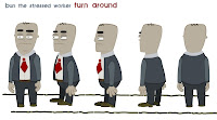


Now I am ready to hit the animating!
I know I've probably spent too much time doing backgrounds first as they're not as important but I find it easier to get them pretty much done first so that if the animating takes longer than expected I can just focus on that instead of worrying about then having to do the backgrounds! And if I have slight changes to make to the background to improve them I'll have time to do that at the end.
I have lots of lists to keep me on track with animating this next week. I can do this!
Peace out!
 This is the original background for the establishing shot between the two characters inside the shop. The characters are in there just to give a sense of space and location. I had to move around the pot plant because it made too much of a wall between the two characters and if the character moved in front of it it could look odd. I also had to extend the framing because it was too square (old school ratio) and I had to work in the shop window for continuity. John suggested putting it right behind the characters in the background but I decided that it would take too much away from the coziness of the shop and it didn't really suit the original shop plan I had in mind. So I decided to put the window behind Bun instead so that you just see part of it. Now the background also has a nicer flow and sense of movement.
 This is what I have ended up with after all the changes.
Putting the characters in the background also gave a good indication of whether the characters work with the background. I changed the colours from the original display frame I had, and with this new frame I had to change the colours of Bun a bit so that parts of him didn't get lost in the background.
 This was the colouring for my original display frame. It was a bit too drabby and dark for my liking. I wanted the shop to be warm and inviting and hippy, so you can see how it has changed from the original to what I have now.
 These images are the basic backgrounds I have developed for the closer shots of the two characters. I used the background from the establishing shot and just tweaked it to fit for these shots. I made them a bit bigger so it gives room for various shots...close and mid, and I can easily adjust it as needed as I animate without worrying about redrawing stuff and spending too much time fixing it. I've made the background slightly blurry too, to give a sense of depth and to give focus to the character.
These are my final character designs. I've just changed Bun's colours a bit since these model sheets (his jacket and shirt) and I need to make his hands less banana like. =)


Now I am ready to hit the animating!
I know I've probably spent too much time doing backgrounds first as they're not as important but I find it easier to get them pretty much done first so that if the animating takes longer than expected I can just focus on that instead of worrying about then having to do the backgrounds! And if I have slight changes to make to the background to improve them I'll have time to do that at the end.
I have lots of lists to keep me on track with animating this next week. I can do this!
Peace out!
Wednesday, May 12, 2010
Final Project - the beginning
Now it's time for the final project!
I'm doing this final piece in Flash so that I can challenge myself and learn new things and become better at using Flash.
I came up with the idea for the script a few weeks ago while brainstorming. Sometimes I write down funny things from the news or stories that happen so that I can use it for reference if I ever need a story for an animation and low and behold one thing that I wrote down gave me the perfect idea to work with for this animation.
A few months ago on Yahoo news I saw an article about how stressed out workers in London get jars of fresh air to help relieve the stress! How crazy but wonderful. And so I did a bit of research on the net about it to make sure it wasn't just a joke but it's not, they really do it. They get fresh air from different rural places around the UK like Townsend and Windermere. Here is one site talking about it. http://www.ecosalon.com/canned-fresh-air/ Check it out.
So the idea from my script is based on that. There's this really super stressed out worker in London who needs a jar of fresh air but the shop that sells these jars have sold out and he goes nuts. At first I was going to make the shop very clinical with maybe a shopkeeper in a lab coat, and then I thought the shop person could be a kid because it's this funky, take-away like shop that sells jars of fresh air but then I decided that it would be more interesting to have this really laid back hippy guy, and to have the shop made from wood on the inside with a lot of plants and they sell other things as well like "chill pills". Haha. I thought it would make for a much more interesting character interaction and also a strong contrast between to dreary, polluted London city outside.
I didn't really have a conclusion for the story apart from the stressed out worker going nuts so I decided it'd be really funny to turn it into an ad kind of thing so that it ends with a caption..."Have you had your fresh air today?".
I still have to refine my script but I've done the rough gesture sheets and turn-arounds for my characters. I just need to computerise it now.
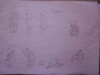
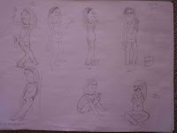
I really need to invest in a scanner. =S
So yeah, this is Bun the stressed out London worker and Paul the hippy.
I think the hardest part about this kind of script is going to be the voices. Whoever does the voice acting will have to get really into it and be really hippy and really psycho. So that's the only thing I'm really worried about right now.
I think doing the Production Schedule is going to help a lot to get this done in time. It helps to have a lot of little goals because just having one big goal can be too overwhelming sometimes.
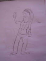
Oh and before I go...I love this image...

I'm thinking that it would be so funny if Bun goes psycho and then you just have cuts to a close up of Paul with this kind of expression on his face. Just a thought. =)
Peace out!


I really need to invest in a scanner. =S
So yeah, this is Bun the stressed out London worker and Paul the hippy.
I think the hardest part about this kind of script is going to be the voices. Whoever does the voice acting will have to get really into it and be really hippy and really psycho. So that's the only thing I'm really worried about right now.
I think doing the Production Schedule is going to help a lot to get this done in time. It helps to have a lot of little goals because just having one big goal can be too overwhelming sometimes.
Oh and before I go...I love this image...

I'm thinking that it would be so funny if Bun goes psycho and then you just have cuts to a close up of Paul with this kind of expression on his face. Just a thought. =)
Peace out!
Saturday, May 1, 2010
Final touches
So we got a one week extension on the Flash project. I was already finished in time for the original date but the extension has given me the opportunity to tweak my animation a little bit.
I tweaked the arms where I was unhappy...it turns out that the reason my nested arm animation wouldn't play is some funny business with the layers so I just put that little bit on a different layer and referred it to the right nested frame and it worked. Go me! Haha.
I also played around with the optimizing and smoothing tools. It made a little bit of a difference but I think it would work wonders for the outline of lined characters.
And other than that I just fixed up some things that John suggested like the feet for 3/4 view in the turn-around and making the inside of her mouth darker instead of the light pink which actually looks much better.
For the next assignment I'll post more pictures and stuff of my progress.
Oh and I also finally got around to getting out the book 'Hollywood 2D Digital Animation' and it is great...so much more in depth than the other one I read. It covers everything about Flash animation and character design and even how to do cool special effects. I think it will definitely help with the final project. I'd really like to challenge myself and learn a lot more about Flash and animating in it.
So now that the last assignment is finished it is on to brainstorming for the final one! =D
Wednesday, April 28, 2010
Other Flash frustrations
Just to note a couple of frustrations and things I learnt with Flash too.
There's a part at the start of my animation where I wanted to get the arm moving from one position to the next a lot better so I broke it down in the nest but then it won't play in the parent level. I keep changing the single frame number to the one it should be but then it just converts straight back to 1 and I've tried everything to fix this but it just won't work. And I have to do the breakdown in the nest because it's just moving the forearm around, not the whole thing. =S
Also I nested my arms inside the body comp but it would be a lot better to put it outside with the head and body, or maybe just to break the top arm and forearm apart. I'm not sure. I just had trouble with the back arm because sometimes I wanted the arm to go behind the body and other times in front of the body so I don't know if you need two different arms on different layers and then just replace it as needed or whether to redraw the arm or what? So this is problem that would need to be addressed if I do a Flash character animation again.
That's my only frustrations that I could think of right now. =)
Animating in Flash =S
I just spent about 5 hours doing a 4 second animation in Flash. Haha. Half of that time was spent actually figuring out how to do it! I thought that it would be very easy but because the character is nested you have to keep making sure that you have 'single frame' selected in properties with the right frame number otherwise you do all this animation and can't see it in the main timeline or it just keeps looping and going haywire. It took me a while to figure this out. So in conclusion, I learnt a lot tonight!
I'm kind of happy with my animation. I think it's cute and she seems alive but it is a little jolty because I couldn't do motion tween with all the parts because my character isn't designed well enough for the motion tween to work properly all the time and it's a bit late to go back and fix her. I've learnt a lot now about things that you need to think about when designing a character for animating and even though Flash can be a bit frustrating and hard to deal with it would be good to learn more about designing good characters for animating and seeing if I can animate it better.
The lip sync and eyes were the easiest parts to animate while the arms were probably the most difficult, especially going from one gesture to another smoothly.
So now all I have to do is make sure I've done everything we need to do and do a bit more tweaking to my animatic/animation. =)
Friday, April 23, 2010
Flash time!
Now it's time for Flash. =D
A few weeks ago I created my characters and did a turn around and then I broke down my main character, the young girl, so that she is ready for animation. I didn't really have much problems with this part of the assignment, apart from the fact that I spent ages trying to figure out what the best way is to draw them into Flash. I also did different mouth shapes and eye shapes so that she was ready to animate.
The next step was creating a proper storyboard (I had my rough ideas down but just had to flesh it out more and get more exact about how my animatic will flow).
I read this great book on Flash animating which has given me more of a scope on things you can do when animating in Flash and it was also great for drawing your characters in Flash. Unfortunately I read this after I designed my characters so I was thinking that I might use Flash for the next assignment so I can experiment with a different style/look and feel using tips from the book (especially using different lines as my design for this piece has no outlines). It's called 'Flash Cartoon Animation' and is written by Kevin Peaty and Glenn Kirkpatrick.
Last week I made my background with multiple layers so that I was ready to do a pan where the levels moved at different times to give more depth. It didn't take me as long as I expected and the thing I mostly had problems with was getting the colours to work together. I think in the future it will be better to spend a few hours before doing colour palettes to create a colour palette for the character and background so that I can then just go and fill it all in. I did the colour for my character first and then had to match the background colours to the characters and although it works now it could probably work better if I planned it all out before I started. Just a thought. =)
So after I did the background I then moved on to doing my pan. It didn't take long at all. I do a pan across the background and then zoom out to see more of it. It was really cool seeing it come to life and seeing how easily your canvas is used as a camera but also how much you'd have to plan your background if you want to do something more complicated.
Today I worked on easing in and out of the movements of the camera. At first I tried to create keyframes on my timeline and do it that way but it's very hard to make it flow and not jolt around. So I decided to use the ease in/out in properties instead and it worked much better. You can bring up a graph so that you can change the pace of the movements by adding points on a graph. It took me a while to figure it out and it still needs a bit of work but it works much more smoothly for creating ease in and outs than adding keyframes and moving your background around physically.
So now I just have to fix the ease in and out as best I can and then do my sound and a little bit of animation.
I'm really enjoying Flash. It's really challenging because you're restricted in some ways but then you can also easily be more creative more quickly. I'd really like to continue to learn how to animate really well in this program and how to make really awesome characters that you can animate without it looking too much like cut out. That's the plan.
Ok on to more Flash now!
Peace out
Subscribe to:
Comments (Atom)
